Bilingual Arabic & English Signage: A Design Guide for Qatar
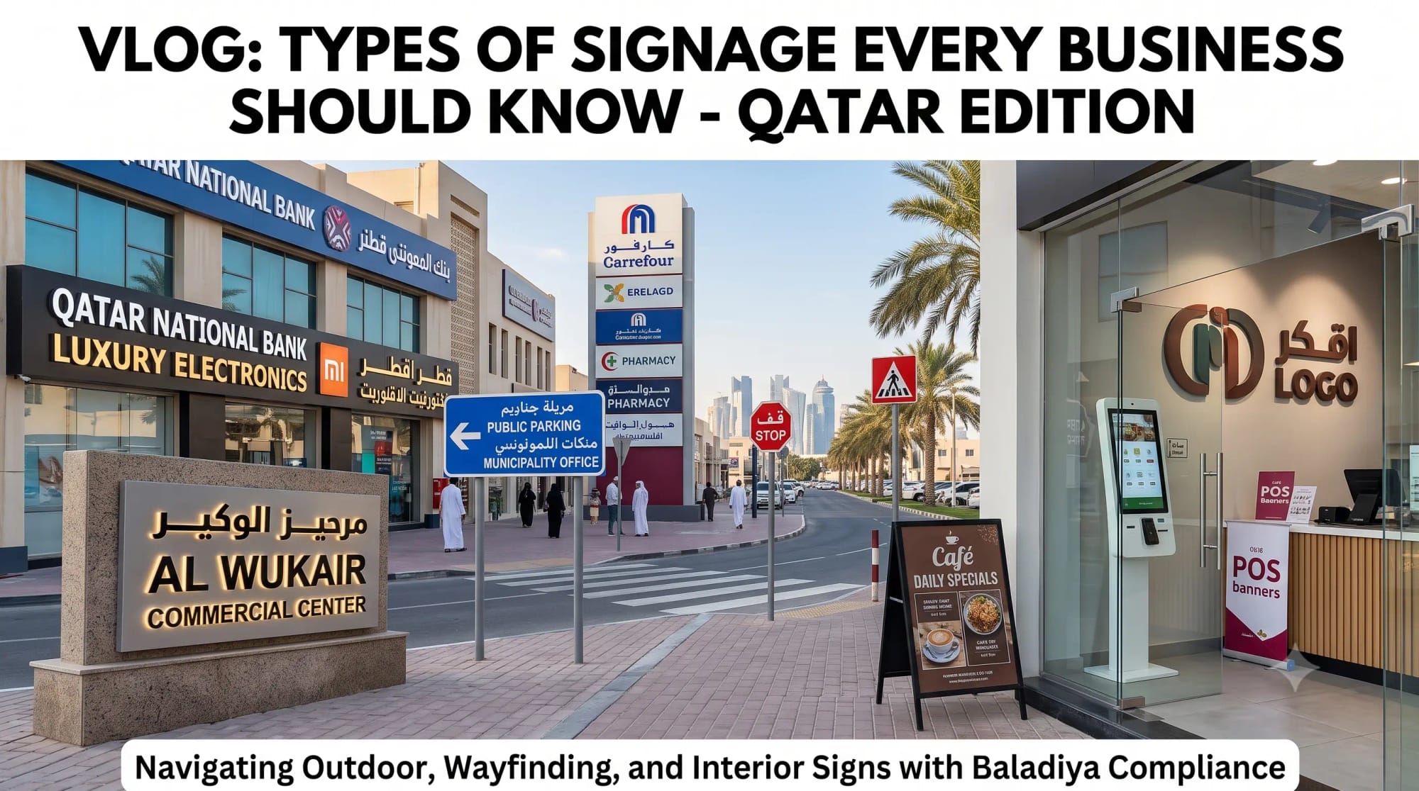
Bilingual signage is a legal requirement in Qatar and a design discipline in its own right. Arabic is not English in a different typeface — it runs right to left, it is cursive, its letters change shape depending on position in the word, and it has no capital letters. Designers who treat it as a drop-in substitution produce signage that is technically bilingual and practically unreadable.
Direction and hierarchy
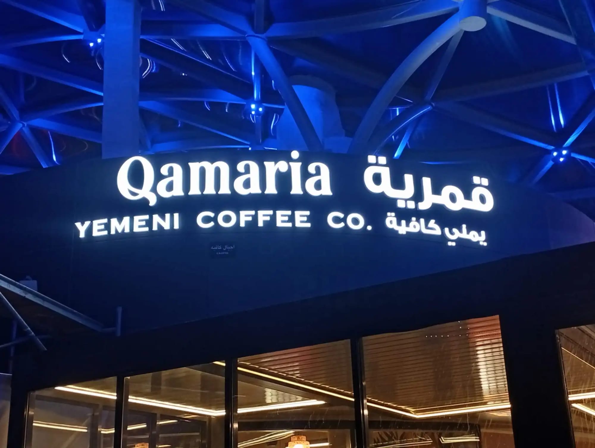
Arabic reads right to left, which inverts the natural reading entry point. On a stacked bilingual layout, Arabic conventionally sits above English. On a side-by-side layout, Arabic sits to the right. Getting this backwards is the fastest way to signal that a sign was designed by someone who does not read the language.
Directional arrows need care. An arrow paired with Arabic text should point in a way that makes sense to a reader scanning right to left, and on wayfinding signage the arrow generally sits on the outer edge in the direction of travel. Mirroring an entire English layout wholesale often produces arrows that contradict the route.
Letter joining is not optional
Arabic letters connect. Each letter has up to four forms depending on whether it stands alone or sits at the start, middle or end of a word. Design software that is not Arabic-aware — or a font without proper Arabic shaping support — will render the letters disconnected, in isolated form, reading as nonsense.
This is the single most common technical failure in Doha signage. It happens when artwork is prepared in an application without complex-script support, when text is pasted between programs, or when a font is substituted late in production. Always outline or flatten Arabic text before sending to production, and always have a native reader check the final proof rather than the working file.
Optical sizing: Arabic needs more height
At the same nominal point size, Arabic generally appears smaller and denser than Latin text. The script's meaningful detail sits in the dots, the tooth shapes and the baseline connections, all of which disappear at a size where Latin is still perfectly legible.
In practice Arabic usually needs to be set noticeably larger than the Latin at the same intended reading distance — the exact ratio depends on the typefaces involved, which is why it should be judged optically on a proof at real size rather than calculated. The regulatory expectation of visual balance between Arabic and English is about perceived weight, not identical point size.
Vertical space also differs. Arabic has ascenders and deep descenders and needs generous line spacing; cramping it to the leading that suits Latin text causes the descenders of one line to collide with the next.
Pairing typefaces
A good bilingual pairing matches stroke weight, contrast and overall texture, so neither language dominates. Many contemporary Arabic families are released as matched companions to Latin families precisely for this purpose, and using a properly matched pair is far more effective than picking two unrelated fonts that happen to look modern.
Avoid highly calligraphic or heavily ornamented Arabic styles for functional signage such as wayfinding, room numbers or safety notices. They are beautiful in heritage and hospitality contexts and genuinely hard to read at speed. Reserve them for identity, not instruction.
Translation versus transliteration, again
Brand names are transliterated so they sound the same. Descriptive and functional text is translated. A wayfinding sign for "Marina Café" would transliterate "Marina" and translate "Café"; a sign reading "Fire Exit" is translated outright.
Never machine-translate signage. Automated output regularly picks the wrong register, mangles proper nouns, and produces text that is grammatically correct but idiomatically wrong. On a sign that will be installed for a decade and read by thousands of people, the cost of a professional check is trivial against the cost of refabrication.
A short pre-production checklist
Confirm Arabic sits above or to the right of the Latin text. Verify letters are properly joined in the final artwork. Check the Arabic is optically balanced with the Latin at real size on a physical proof. Confirm line spacing accommodates Arabic descenders. Confirm brand names are transliterated and functional text translated. Have a native Arabic reader approve the final proof. Only then release to production.
We typeset Arabic properly rather than machine-generating it, and we proof bilingual artwork at real size before anything is cut or printed — because a sign that reads badly in Arabic is a sign that has to be made twice.
Frequently asked questions
Should Arabic go above or below English on a sign?
On stacked bilingual layouts Arabic conventionally sits above English. On side-by-side layouts Arabic sits to the right, reflecting its right-to-left reading direction.
Why does my Arabic text look like disconnected letters?
Arabic is cursive and its letters change shape by position. Software without complex-script support, or a font lacking Arabic shaping, renders letters in isolated form. Outline the text before production and have a native reader check the final proof.
Should Arabic be the same size as English on signage?
Usually not. At the same point size Arabic appears smaller and denser, so it typically needs to be set larger to achieve visual balance. Judge it optically on a real-size proof rather than matching point sizes.
Can I use Google Translate for my shop sign?
No. Machine translation regularly produces wrong register, mangled proper nouns and broken letter joining. Always use professional translation and have a native Arabic speaker approve the final artwork before fabrication.